
White Rabbit Group
White Rabbit Group is a software development agency that designs and develops applications with startups as well as established brands such as Nike, Disney, Red Bull, PayPal, and AMD. I consulted for White Rabbit and enjoyed designing web and mobile applications for several companies.

ABOUTTREES WEB APPLICATION
COMPANY
ABOUTTREES
DATE
03/01/17
DURATION
4 WEEKS
BASED IN
CHICO, CA
AboutTrees is one of California's largest tree servicing companies and it operates out of multiple locations throughout the state. I was tasked with designing a native iPhone and iPad application as well as a web app counterpart. The app was created to help consolidate communication between office administration, estimators and crew leads.
GOALS
-
Facilitate more efficient communication between admins, estimators and crew leads throughout the process of creating, scheduling, and organizing jobs.
-
Help create a system that would allow for easier scalability
-
Utilize geolocation for marking properties
RESEARCH & WHITEBOARDING
AboutTrees did not have an existing application, so the first step in the process was to better understand the current workflow within the company. At the time, all communication and scheduling were performed through email communication and Google calendar. As such, I went on-site and interviewed employees with various roles within the company to inquire about pain points within the current system.
Throughout these sessions, I documented how the existing processes worked between administration, estimators, crew leads, and crew members. Very quickly it became apparent that a more structured process with access to technology such as geolocation through a mobile device would be immensely time-saving. It was through this process that the high-level flow was defined through whiteboard illustrations (not pictured).
WIREFRAMING AND ITERATION
After establishing high-level flows through interviews and whiteboarding, it was time to iterate through the granular details of each of the screens in the flow. I started by creating a set of medium-fidelity wireframes that I presented to the company. One of my goals was to obtain continuous feedback from the team, which allowed me quickly iterate through several sets of wireframes and prepare for the final design.
Through this process, we were able to hash out a new system that allowed...
-
System admin to create, manage and schedule all jobs and users from the office
-
Estimators to quickly mark properties using geo-location and standardize the reporting process for an increased level of efficiency, reduced errors, and much more consistency
-
Estimators to quickly email complete and detailed estimates to clients from the job site
-
Crew leads to spend much less time communicating with the office as to the work that needs to be done and focus on leading a team through this process.
-
Crew leads to invoice clients quickly and easily remotely in a professional manner

Initial set of wireframes.

A further iteration of the wireframes with team sourced comments.
VISUAL DESIGN
After feeling confident with the wireframes and requirements, I proceeded to the visual design. Previous to this step, medium-fidelity wireframes were created for mobile, which is typically the most difficult device to design for due to limited screen real estate. With these wireframes in hand, it made the process of moving on to the final visual design for all devices a very straightforward process.


Tablet flow with final design.

Mobile final designs.

Web app final designs.
INTERACTION DESIGN & ANIMATIONS
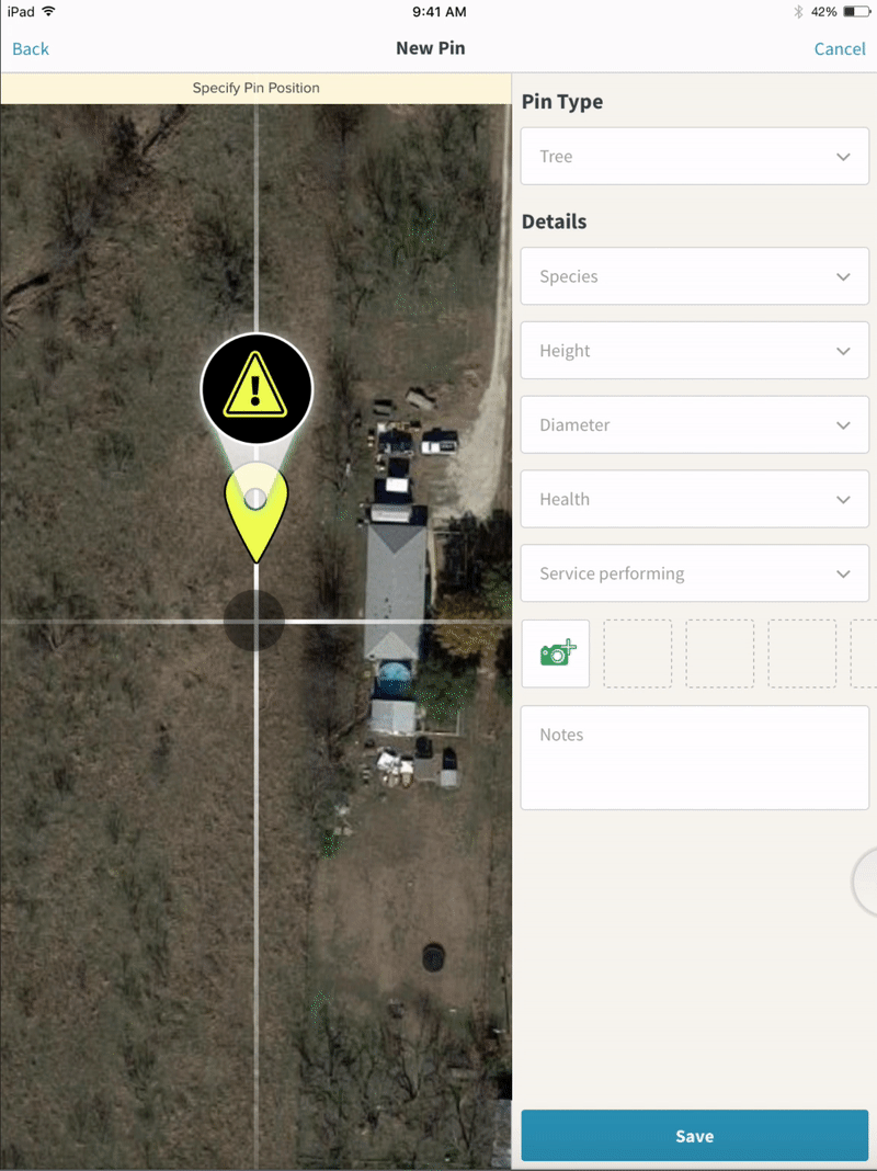
Mobile apps typically require a great deal of interaction design, and this app was no different. The following two examples below illustrate the use of animations/interactions in the app that help to both increase usability and add an element of delightfulness to the experience.
The first was a pin animation that occurs directly after specifying a pin location. This is a high-fidelity animation that may not be directly related to a usability improvement but helps to add a layer of higher fidelity which helps build an aesthetically clean experience.
The second animation (shown below) is directly related to the UI of the app. Due to the high number of fields used throughout the app, I felt it vital to save screen real estate whenever possible. Using this animation pattern made popular by Google Material design, I was able to more effectively make use of space throughout the app.
CONCLUSION
Overall I was very pleased with the process, the deliverables, and the final result. The client was very pleased and due to a continuous feedback loop and user-centered approach, there were no surprises to the client.

FIRESTORM WEB APP REDESIGN
Firestorm is one of the nation's largest private firefighting companies. I redesigned the company's existing web application as well as designed several new additions to the app including an inventory management system.
COMPANY
FIRESTORM
DATE
07/01/17
DURATION
2 WEEKS
BASED IN
CHICO, CA
BEFORE

AFTER


DAPIT MOBILE APP
DapIt is a startup based in Chico, CA that focuses on reimagining the process of buying a gift card. The customer primarily interfaces with a mobile app which I designed from the ground up. This project was contracted through White Rabbit Group.

WHY DAPIT?
DapIt makes it simple for businesses to create their own gift cards and encourage users to purchase these cards through a mobile app.
In addition, the business discovery aspect of the app will allow users to discover other local businesses that they may also be interested in.
While this serves as the foundation of the app, the most unique feature of the app is social sharing. DapIt aims to turn gift card sharing into a social activity, just as other companies have done in their respective fields.
User Signup
Signing up is simple. By utilizing Facebook login, the user will be able to create an account with one button press, without needing to upload a profile photo or enter basic information.

Business Signup
Signing up a business can be done easily after a personal account has been created. A user can register a business and quickly toggle back and forth between business and personal accounts. This process is simple and can be 100% completed from a mobile device.

Finding Local Businesses
After the user has logged in and created an account, he or she will be able to quickly see participating businesses nearby, or find a specific business by searching within a category. This will allow the user to quickly locate the store that they are currently shopping in (if they discover the app through a promotion in the store), or simply browse to find other participating businesses.


Business Pages
From a business page, a user will be able to view images of the business, quickly contact the business, “Favorite” the business, and of course purchase a gift card from that business.
From a business perspective, management of this page is essential and powerful, as it allows for the upload of company logo, background image, contact information, and miscellaneous photos.
Buying Gift Cards
Users can quickly and easily purchase gift cards directly from a business page. This process has been streamlined to be as simple as possible. After a gift card has been purchased it will be held in the app’s “Wallet”, where more actions are available.

Sharing Gift Cards

COMPANY
DAPIT
DATE
04/01/18
DURATION
2 WEEKS
BASED IN