
Onboarding Redesign
COMPANY
BUILD.COM
DATE
02/01/17
DURATION
3 WEEKS
BASED IN
CHICO, CA
CONTEXT
The Build.com mobile app plays a key role in Build.com's long-term investment in innovative technology. The app's onboarding process however had not been altered since its inception. As such, I set out to research the current flow and look for areas of opportunity.

Original onboarding flow.
GOALS
Primary Goals:
-
Increase onboarding completion rate by 15%
-
Increase push notification opt-in by 10%
Secondary Goals:
-
Ensure branding and copy is reflecting a consumer-friendly experience
-
Identify which value props are being effectively conveyed
-
Add a higher level of fidelity to the entire onboarding process
RESEARCH
I created a remote usability campaign and recruited users to the study that were not familiar with Build.com. Marketing spend differs substantially on the Build.com native app when compared to the website, so I wanted to ensure unbiased opinions of people unfamiliar with the Build.com brand. Throughout this study, one of the creative measures I took to check for branding misalignment was to ask for users' expectations at each step in the process of the onboarding flow.
KEY FINDINGS:
-
There was a clear disconnect between the onboarding experience and the app experience. The imagery and copy used on the first screen gave the impression that the app was only meant for construction professionals even though the app is targeting consumers. Participants were confused as to the service that Build.com offered; one user hypothesized that Build was a construction management platform, based on the ambiguous copy being used. This led to a rewrite of onboarding copy as well as a focused need for consumer-friendly visuals/animations.
-
Most participants could not justify creating an account from the first screen. This helped build the case for account creation at other key points in the user journey.
-
There was confusion between the purpose of the "Skip" button on the first screen and the "Continue as Guest" button. This minor detail caused participants to unknowingly skip onboarding altogether when the intention was simply to proceed without signing up.
-
The existing copy related to saving seemed to work very well and serve as an effective way to encourage push notification opt-ins. This message was consolidated further in the redesign.
-
Participants were not aware that Build.com has live product experts available to chat or speak with. This is a large competitive advantage over other websites, so this was also clarified in the redesign.
Example: Participant illustrates disconnect between app and onboarding.
Example: User is unaware of live advisors after onboarding is complete.
VISUAL DESIGN & VALIDATION
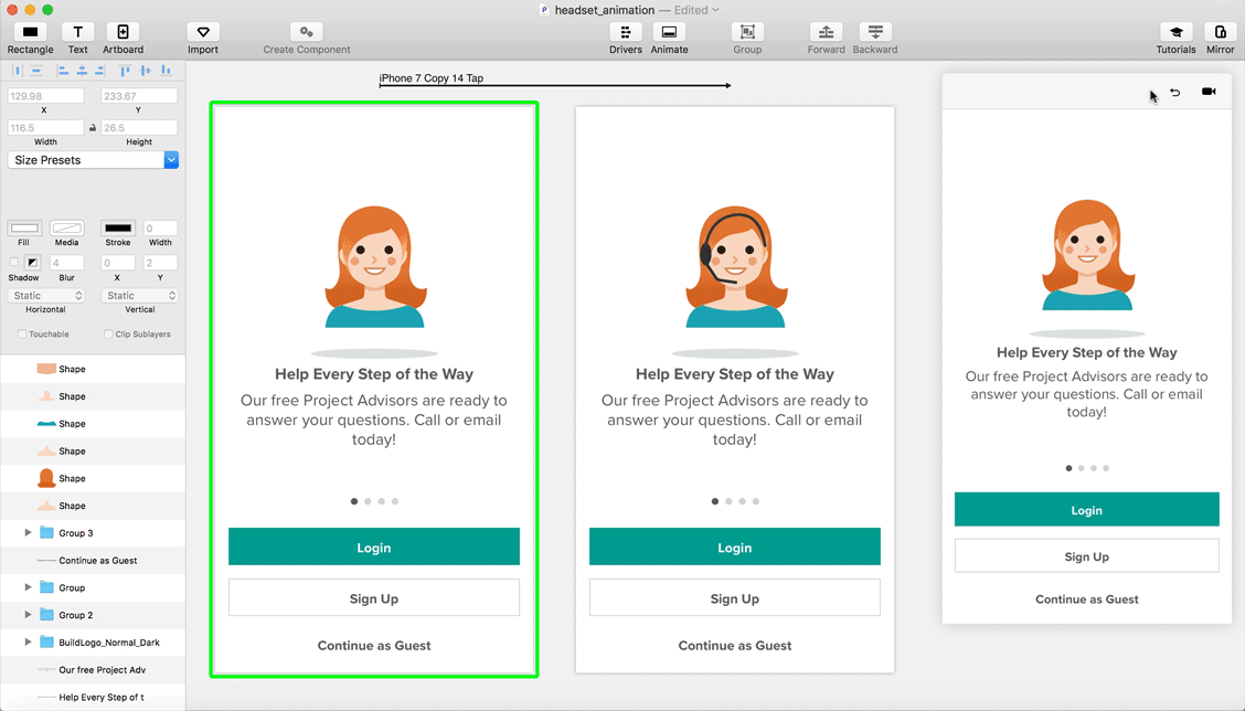
After the research was analyzed, I distilled the findings into updates to the visuals and copy within the onboarding flow. I created a new set of illustrations that support updated copy to clarify confusing points uncovered earlier. My goal with the illustrations was to add a simple sense of lightheartedness to the app that is is reflective of the actual app experience. In addition, better-alignment to current design trends helped to build trust with first-time users.
Final Design

PROTOTYPING IN PRINCIPLE
After the visuals were finalized and the design decisions were validated, I animated each illustration using Principle. Principle allowed me to quickly test and iterate quickly through several animations.
Editing in Principle.
HANDOFF WITH AFTER EFFECTS
Principle works fantastically for quickly prototyping the desired interactions, however, it quickly reaches its limit when reaching developer hand-off. Principle only allows for animation values to be extracted, however, developers must still manually recreate the animations, which is a tiresome process with much designer back-and-forth communication to perfect each animation. For this reason, I chose to recreate each animation in After Effects and export them via Bodymovin. This allows each animation to be exported to a JSON file, so that developers can then integrate each animation directly into the app with Lottie, resulting in a 1:1 representation of what was originally designed, with the minimal development effort.
Two of the seven animations.
IMPACT
Overall, the implications of the redesign were well-received by various stakeholders throughout the business. In terms of impact, I measured qualitative feedback and measured exit rate within the onboarding flow. The new flow and design ended up resulting in a 28% increase in onboarding conversion rate and also resulted in a slight increase in conversions. Push-notification opt-ins from the relevant screen, increased by 15% which was significantly higher than the goal of 10%.
Qualitatively, I reran the original usability testing campaign and none of the original issues were surfaced. In conclusion, this redesign felt like a win, and in my opinion, was attributed to the process used to land upon the final design.